
Committee App
Brand identity, UI/UX design and investor materials for a fintech app rebuilding community savings for the modern world.

IndustryFintech / Financial Inclusion
Service PackageCommittee is an early-stage fintech app inspired by ROSCAs, community-based savings models used across the world for generations. The app makes it easy for users to pool money in trusted circles and take turns accessing a shared pot.
But Committee is more than a financial product. The founders did not read about ROSCAs in a report. They grew up with them, relying on community savings and mutual support to survive one of the hardest periods a family can face. Committee is built on those foundations. Resilience, shared responsibility and the power of collective uplift.
Big Mood came on board at the earliest stages, working closely with the founding team to shape both the visual identity and the product experience. The brief was to make a financial tradition feel intuitive and joyful to interact with, build a brand that balances tech credibility with genuine warmth, and create investor materials that could tell the human story behind the product as compellingly as the commercial one.
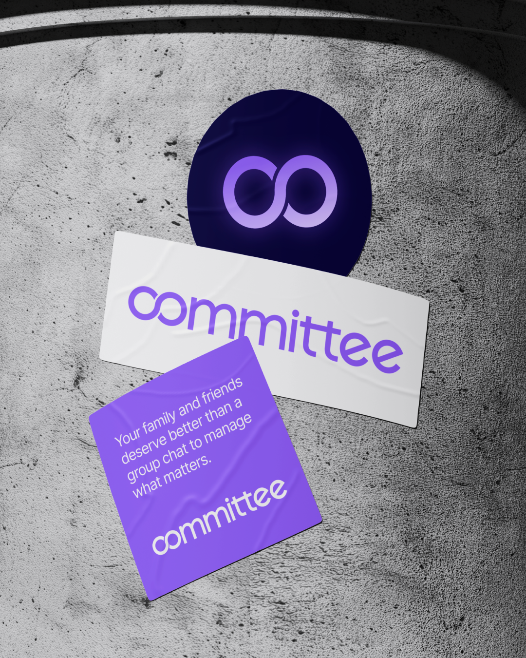
The visual identity deliberately avoids the cold confidence of the corporate fintech world. A softer colour palette, custom iconography and type treatments that suggest community and mutual support rather than institutional authority. The logo is a typographic wordmark built around a single idea. The "co" characters interlock to form an infinity symbol, representing the continuous cycle of contributions and payouts at the heart of every ROSCA. The collective flow of resources within a trusted group, captured in two letters.
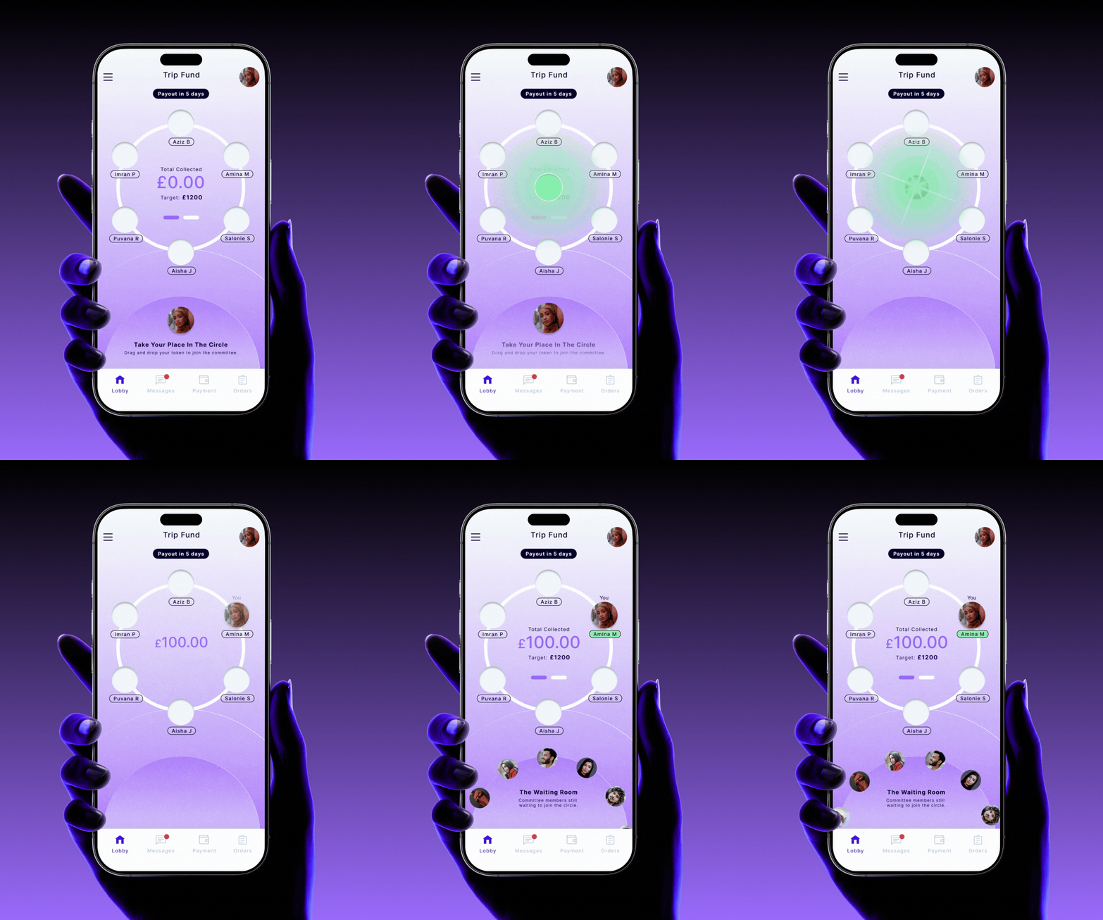
The most significant design challenge was the Committee Lobby, the shared space where each member takes their turn to contribute to the pot. The solution was a circular ring interface where each member's avatar takes a seat around the pot. When they’re ready to commit their funds, they drag their avatar into the centre, triggering a payment prompt. The design borrows from the ritual and rhythm of the savings tradition itself, making the act of contributing feel like taking your place in a trusted cycle rather than completing a financial transaction. It made turn-taking visible and satisfying, created a strong sense of group presence and reinforced trust through interaction that feels intuitive and almost game-like.
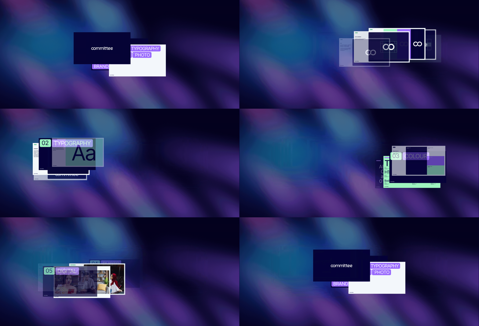
Alongside the brand and product, we created a visual-first investor deck designed to help the founders tell their story to audiences who may never have encountered a ROSCA before. The deck builds understanding before building the commercial case, weaving together brand, product and financial vision into a single narrative.

“Natasha has been incredible to work with. She has a real talent for creating distinctive, on-brand designs that elevate every project she touches. Her work has set the visual tone for our app, produced clear and engaging marketing graphics, and brought our pitch deck to life. I highly recommend working with Big Mood Studio.”
Safwan Burki, Co-Founder and Chief Product Officer